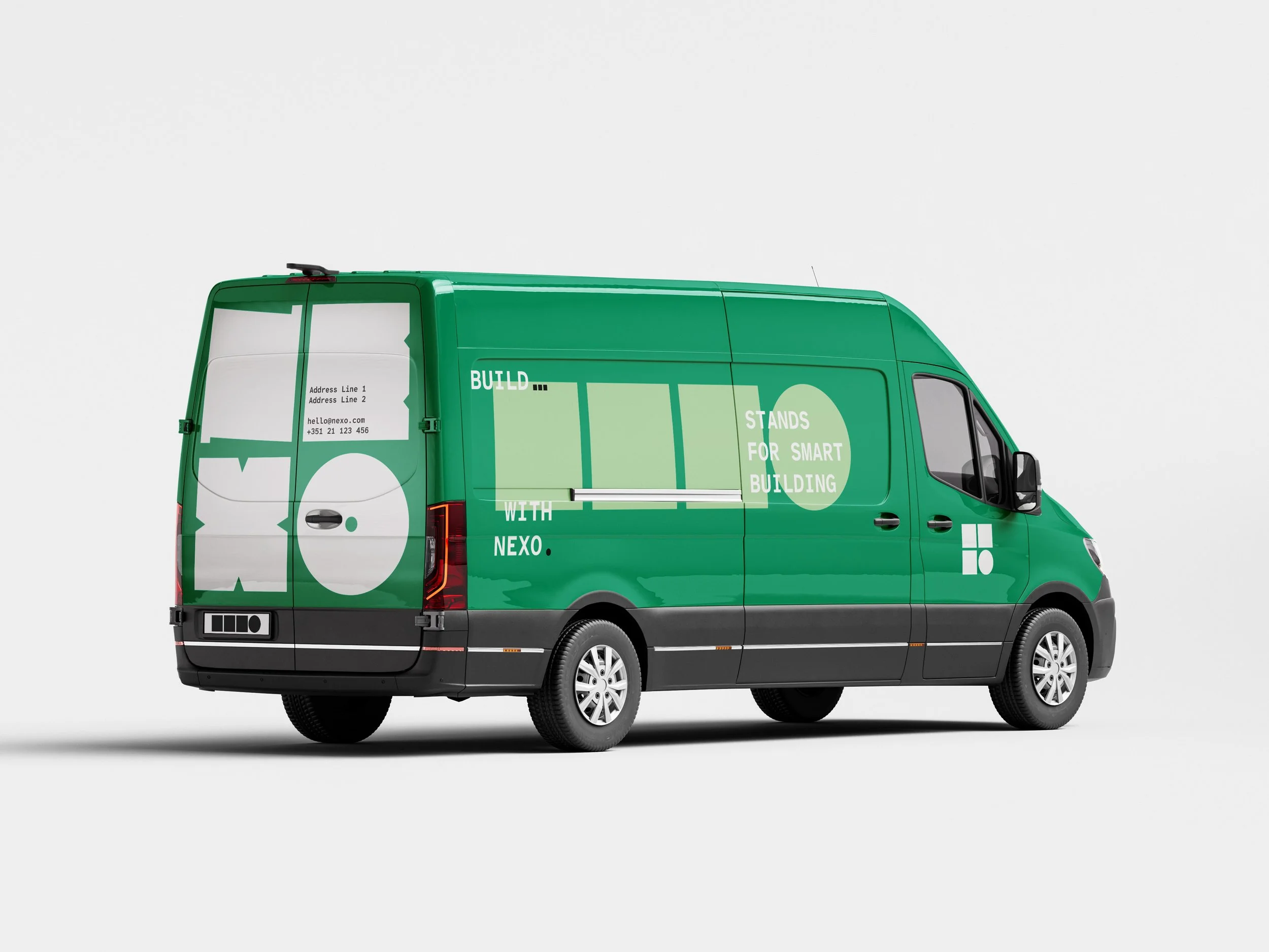
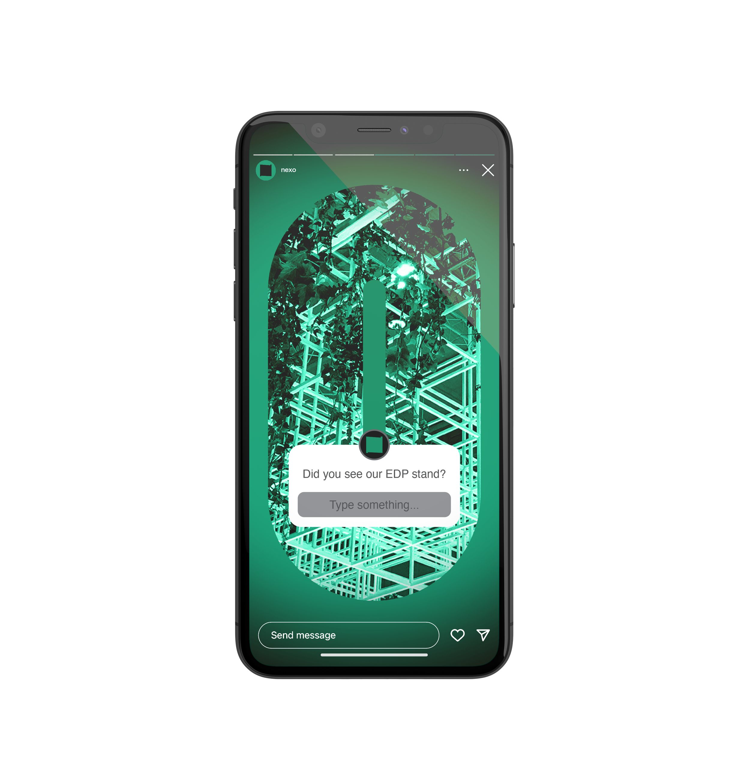
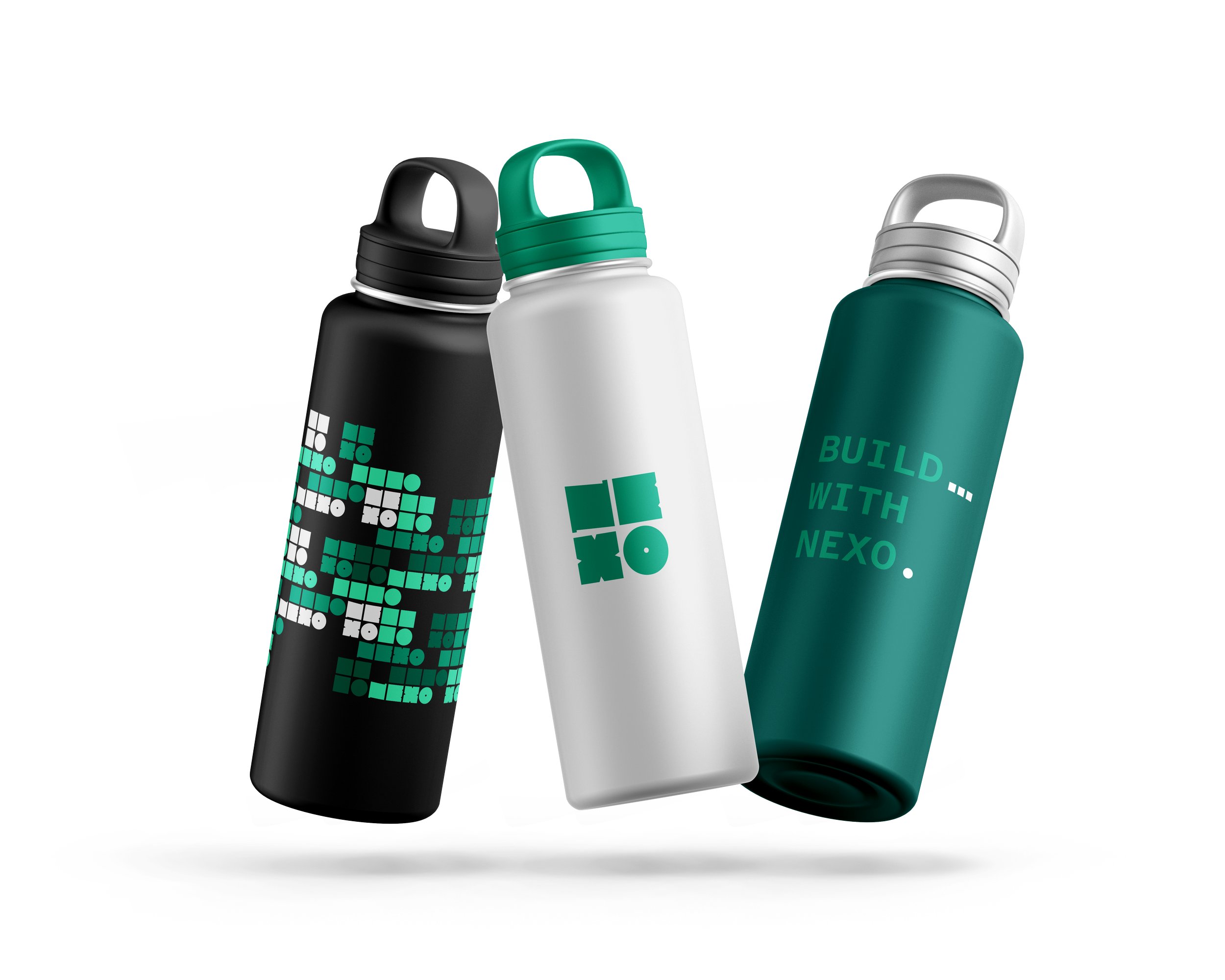
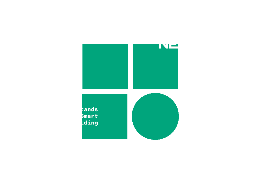
NEXO’s identity was built to be modular, flexible, and scalable, just like the service it provides — Stands for Smart Building with emphasis on sustainability.
It is based on typography as the core of the brand, with strong structural inspiration (grid and blocks), supported by a green palette that conveys sustainability and trust.
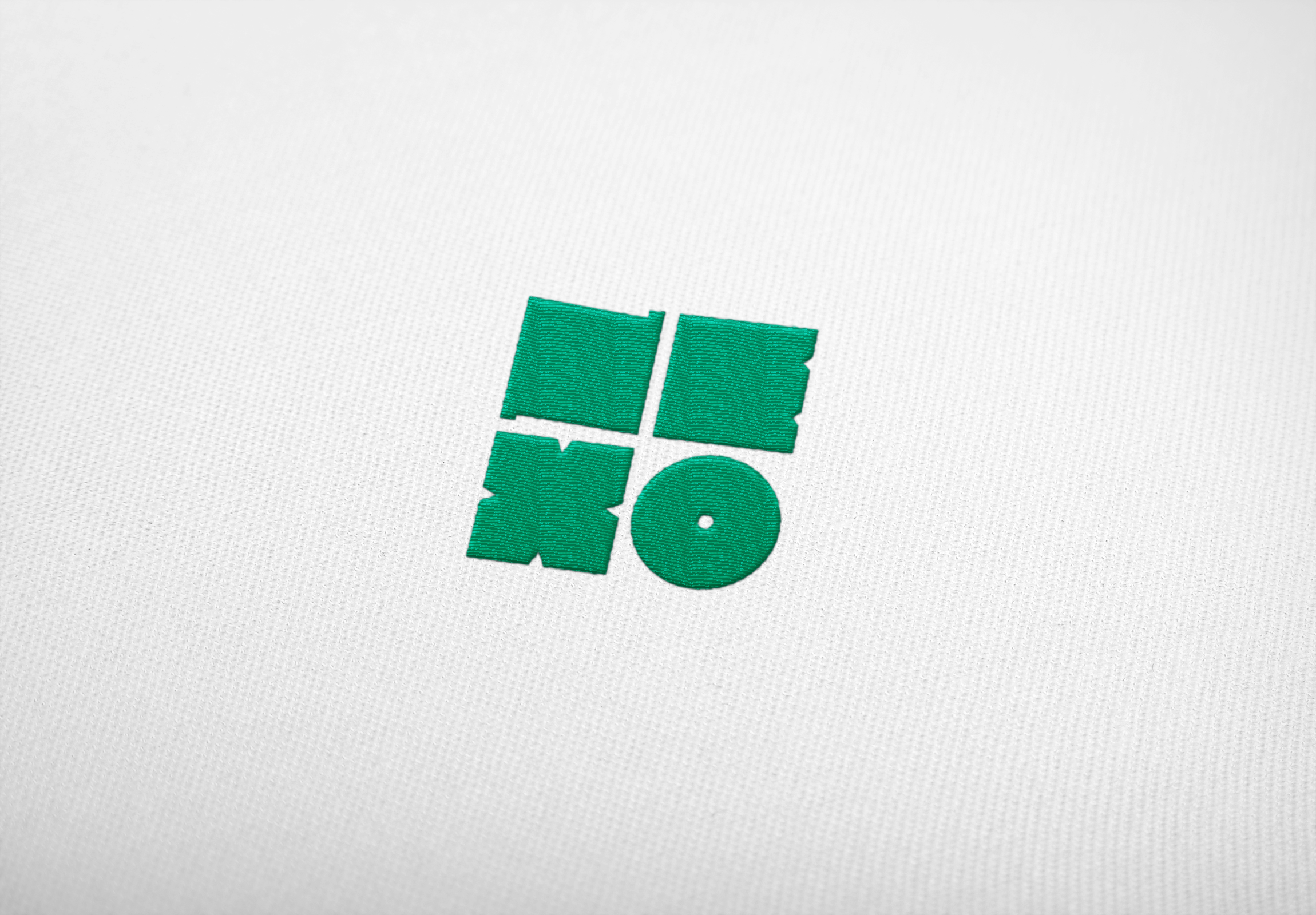
The logo and its variations represent NEXO’s own process: transforming emptiness into structure, possibilities into a concrete experience.